My School Map Sucks
So I Made A Better One In 3D
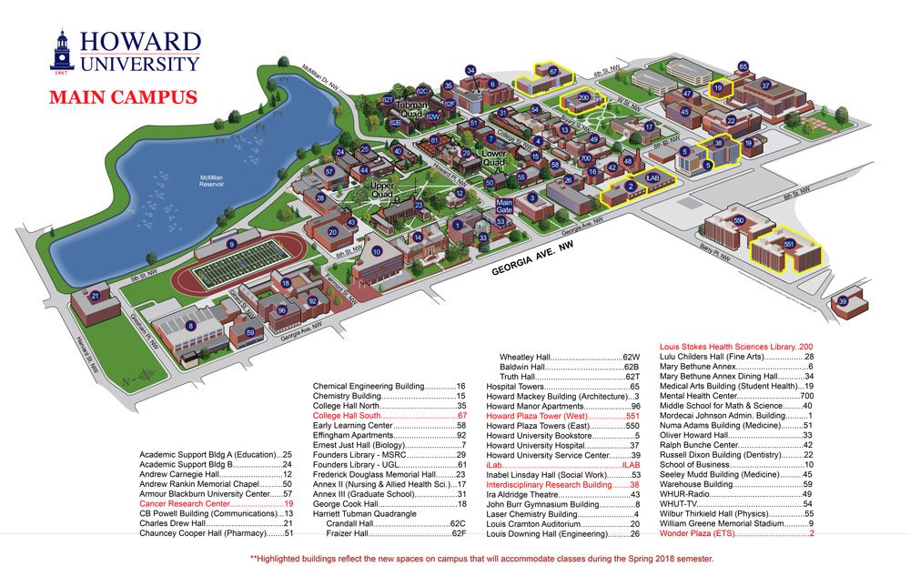
I go to Howard University, and I remember picking up a map of the university's main campus in DC. The map had very little coherence, and the building numbering system had a very uninterpretable pattern, if any at all.

Maps like that confuse tourists and new students. It's not as much of a problem to administrators, faculty, staff, and continuing students, since they have a mental model of the campus simply due to repetition and continued exposure. But, this leaves those who are unfamiliar with the campus in a weird situation where they're left to decide between burdening a passerby for assistance and exploring the campus without help, unsure of how they'll reach their destination.
With this problem in mind and having a couple days of procrastination from school work, I decided to make a much more intuitive map. I wanted it to be immersive and provide a much better insight into how certain destinations relate to the user with respect to distance and direction. Knowing this, my first idea was to create an augmented reality experience so that destinations could overlay live ontop of their phone's camera view for easy interpretation.
The problem with a straightforward augmented reality experience is the performance-accessibility tradeoff that it poses. Making the experience smooth and snappy would be simpler if I used a framework that has lots of abstracted performance optimizations like Apple's ARKit. Using ARKit would restrict the demographic of users to those who have newer iOS devices, and I'm sure that's a much smaller group of people than those who actually explore campus. So, I decided to use a web-based experience, as this would be accessible to a wider range of devices in several browsers. To mitigate the risk of the slowness that a web-based AR experience would have as a result of using both the device's camera and orientation sensors, I decided to proceed without the camera component.
I searched for approaches to AR/VR experiences on the web and, along the way, learned about the experimental WebXR APIs. I decided to use three.js to place objects in 3D space and use a three.js plugin that simplifies responding to device orientation so that I can move the camera accordingly and acheive an immersive experience. I'd never spent a significant amount of time using scene-oriented interfaces like those found in game development and 3D modeling and animation before, but using three helped provide a decent introduction.
I spent the bulk of my time learning the basics of the three API and using it to build an acceptable scene for the project, leveraging text objects as the most visible parts of the map. It's at this stage that I learned of object position, scale, and rotation and how each of the properties exists for an object relative not only to its nearest parent in the scene but also to the world, or the scene in general.
I then chose a spot on campus that would serve as a good example for me to use in deciding what destinations to display. The place I chose is surrounded by a lot of buildings and doesn't clearly describe which is which. After tweaking my web app, the text was aligned with each building's position in physical space. The next step was to determine an intuitive way for someone to enter the experience.
The de facto standard for visiting websites from physical points is through the means of QR codes, and a QR code would suffice in this case. A problem arises, though, between scanning the code and entering the experience, where the user may naturally point their phone down after scanning. This would cause unpredictable behavior in the experience that sometimes results in misalignment between the physical and virtual destinations, ruining the experience. A solid solution for this was to remind the user through on-screen instruction to keep pointing their phone at the QR code.
At this point, the experiment was at an acceptable point for a test/demo, so I went back to my decided upon spot and tried it all out. With some help from a friend of mine, I was able to record the experience with and without the web app open so that you can witness the experience as if you were there.
The videos are a bit out of sync but here’s the 3D map. If you’re on campus the QR code is at the physics building sign pic.twitter.com/Z3gq82B0Hd
— Nash (刘光瑞) (@aunyks) February 25, 2020
The experience was smooth, and I'm satisfied with the result. I think it was a nice reason to put off school work in a cold Februrary this year. These two days were really insightful and opened my eyes to entirely new concepts in computing. I think it even sparked my current interest in extended reality, and I'm very happy with what I'm still learning on this journey.