Designing My First Credit Card
A Fun Project
I was scrolling through Twitter when I saw someone had interacted with one of Julian Lehr's tweets. I'd never seen his account on my timeline before, so I visited his profile. One of his most recent tweets featured some credit cards that he found to be well designed.
List of well-designed credit cards:
— Julian Lehr (@lehrjulian) August 16, 2020
• @n26 Transparent
• @pointcardhq Runway Yellow
• @CashApp Glow in the Dark
• @AppleCard Titanium
(I'm writing a blog post about card design - what other companies should I look at?) pic.twitter.com/neU8au0jMZ
3D modeling has piqued my interest lately, so I decided to use his tweet as inspiration and challenge myself with a design project.
With this in mind, I opened up Blender and got to transforming the default cube into the shape of a credit card. I'd just learned how to round corners and edges, so this part was relatively straightforward. The novelty in this project came primarily from the process of texturing the card and actually putting a design into the card, since the default all gray look wasn't at all satisfactory.
To start texturing the card with the design I had in mind, I needed to export the card's UV Map from Blender. I had no idea how to do that beforehand, but luckily there's a sea of tutorials related to this on YouTube. I used BornCG's excellent tutorial on the topic, and, while I ran into some issues with my map not scaling and formatting properly, I got it to export somewhat quickly.
The next step was to actually design the card. I didn't think GIMP was the best tool for a job like this, and I've always had a fascination with Figma despite not knowing how to use it, so I used this project as a reason to not only practice my overall design skills but also get familiar with one of today's most popular design tools.
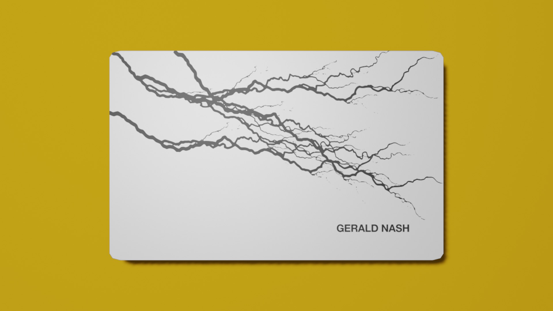
Importing the map into Figma was as simple as a drag and drop, since I most often use the desktop client. I decided to go with a card lacking a chip so that I had less constraints on the front of the card. This gave me more space to feature realistic black lightning bolts. The real challenge in the design came from deciding what to put on the rear.
If you look at any payment card in your wallet, it probably has a lot of small text on the back that you previously didn't notice. Phone numbers, web links, and random disclaimers and notices are littered on millions of payment cards. They provide lots of visual noise and, in many cases, visual balance that we often take for granted.
I didn't feel like adding these artifacts not only because I didn't exactly know what placeholder text to use but also because I wanted to give myself more creative freedom to explore. With this being said, I also need to consider what information or artifacts we all expect to be on the back of a payment card. The mag stripe, credit card number, security code, and expiration date are the first of which that come to mind.
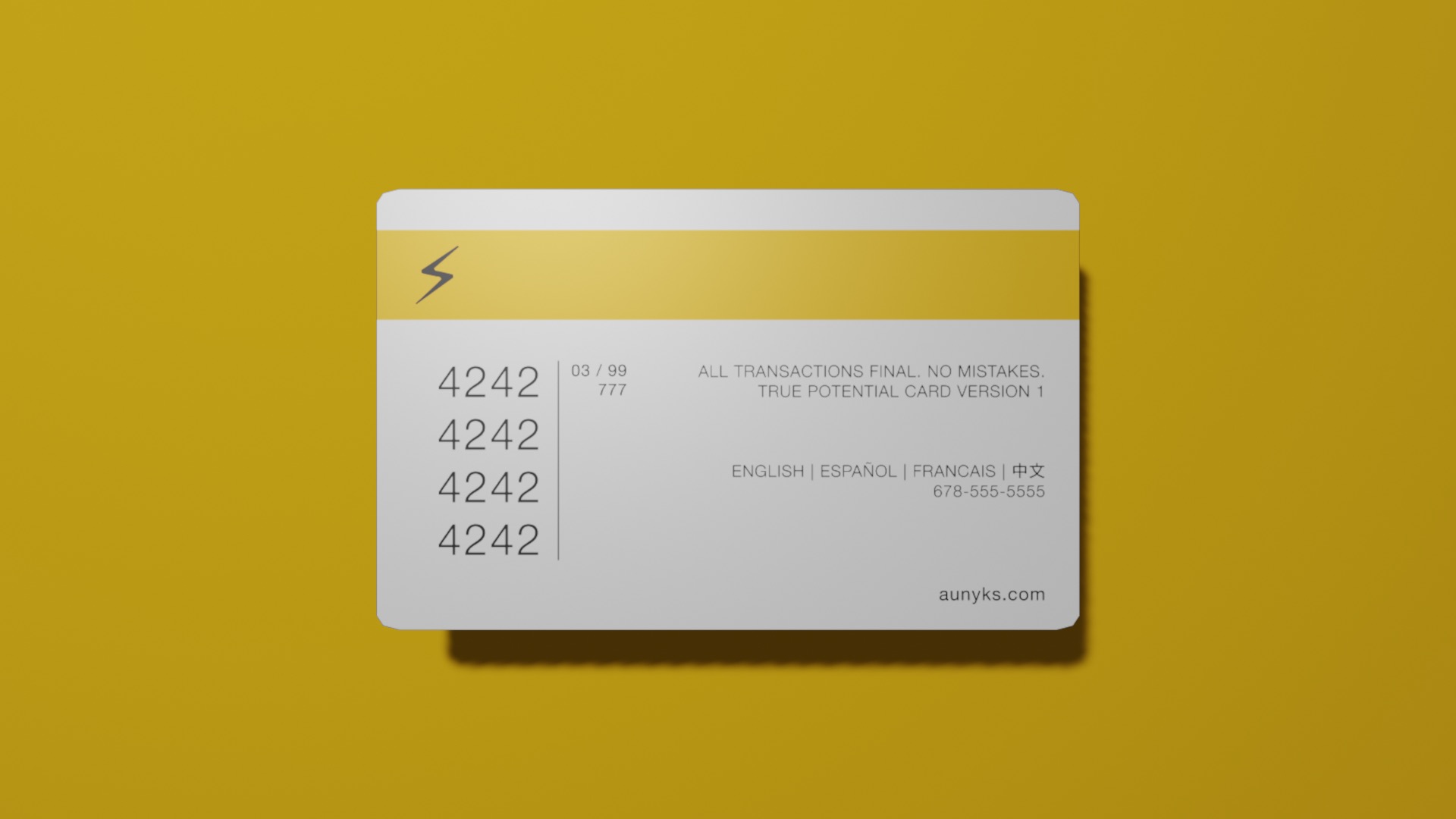
Without getting into too much detail, I decided to group the essential payment information close to each other since they're often needed at the same time. Because of its exceptional length, I gave the credit card number more size to increase visibility when reading it. I also chose to use a vertical partition to separate it from the expiration date and security code to help prevent a reader from getting overwhelmed with numbers. The vertical stacking of parts of the credit card number allowed me to conserve more space when keeping the group to the left of the card.
The magstripe was pretty simple in my opinion. I just made it my solid yellow color and put a lightning bolt toward the left side of the card to help make it my own.
The right side of the card had a lot of open space that needed to be filled for some balance. Frankly, I had no idea what to put here, so I decided to get creative and put random information in the space like the title of the project, the languages I speak or am learning at the time, and a random phone number with an Atlanta area code. To round it all off, I put my domain in the bottom corner as a sort of signature.
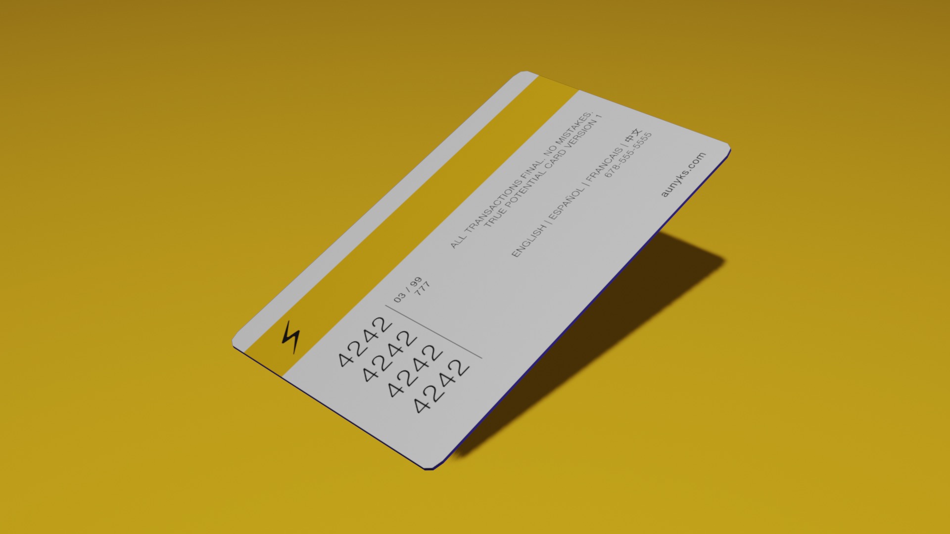
The next step was to export this newly textured map and apply it in 3D to the card in Blender. This was also somewhat straightforward, since I just needed to import the new map and connect some nodes in the material editor graph. The card was essentially finished, so now I just needed to capture some photos of it. I'd learned from my first Blender 3D project a week earlier that using lighting and camera work to design nice scenes can get really tricky really quickly. But, that prior experience paired inspiration from the shots in Julian's tweet gave me the necessary skills to get some decent photos. At this point, I was pretty much finished.
Here’s my custom credit card concept:
— Nash (刘光瑞) (@aunyks) August 19, 2020
“True Potential Card v1”https://t.co/r65UfmeMpS pic.twitter.com/wHogc3nY4A
Overall, it was a fun project, and I hope to try so many more in the future to get really good at stuff like this. If you want to play with the card yourself and get an up close view, check it out below.
Tools Used
- Blender - Modeling the card, exporting/importing its UV map, capturing photos, and exporting the card
- Figma - Texturing the card and actually applying the design
- Three.js - Rendering the card in the browser
Things Learned
- How to bevel and unwrap basic objects in Blender
- How to export/import UV maps in Blender
- Vector operations, layering, and methods of grouping in Figma
- Basics of user-centric design